
My Role:
UX Researcher, UX Designer, UI Designer, Content Strategist
Client:
ESMoA (El Segundo Museum Of Arts)
Solution:
Assess current functionality via benchmark testing, translate data into design fixes, and improve copy-write to increase user understanding.
Challenge:
Increase user understanding of organization, and create a more functional interface.
Users:
Potential ESMoA visitors
Donors
Volunteers
Methods:
Competitive Audit
Remote User Testing
Heuristic Analysis
Content Strategy
A/B Testing
Tools:
Sketch
Trello
InVision
Otter
Photoshop
Exploring the Problem Space
ESMoA is art laboratory based in El Segundo, California that focuses heavily on immersive art experiences. They also have an Academy that features courses for users to learn how to empower individuals with disabilities. While they are more than a museum, they had a hard time communicating who they are to users. The full scope of programs and opportunities at ESMoA were not completely apparent to users, and some left the website still not understanding what ESMoA is, and/or does. During COVID, it is even more important that they can spread their message and be accessible to users. My goal was to make sure users left with an understanding of ESMoA, and an inspiration to learn more and get involved.
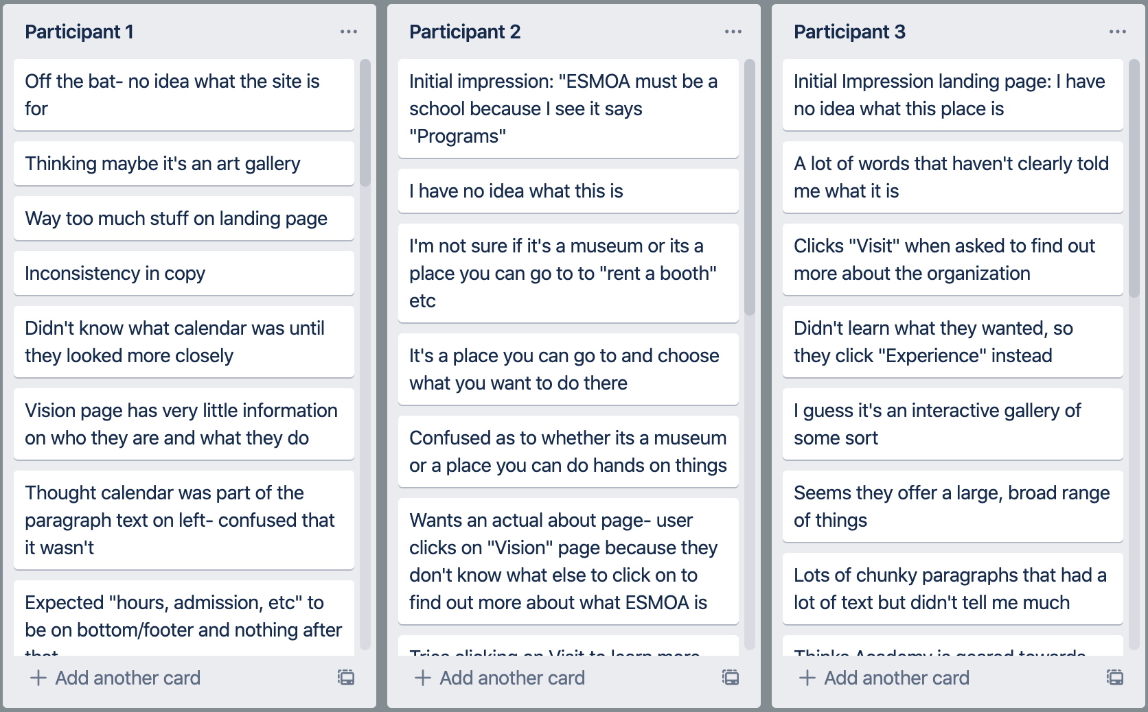
User Insights

Wireframing

Design Recommendations

before: Homepage
Lack of hierarchy, unclear descriptions of what ESMoA is, no “Home” button, hard to read text, lack of footer.

After:Homepage
More whitespace to ease cognitive load, succinct description of who ESMoA is to help users understand the organization, high contrast call to action donate button, grouped features, addition of footer with social media links to match mental model.

Before: About Us
Unclear description of ESMoA, videos with no context, overload of information on right, lack of footer.

After: About us
Addition of “About ESMoA” page, clear description of org, headers to explain content, added context to video, hours included.

Before: calendar
Low contrast/hard to read search fields, heavy cognitive load, low contrast text.

After: calendar
Left aligned text, higher contrast search fields, title of event, easier to see buttons.
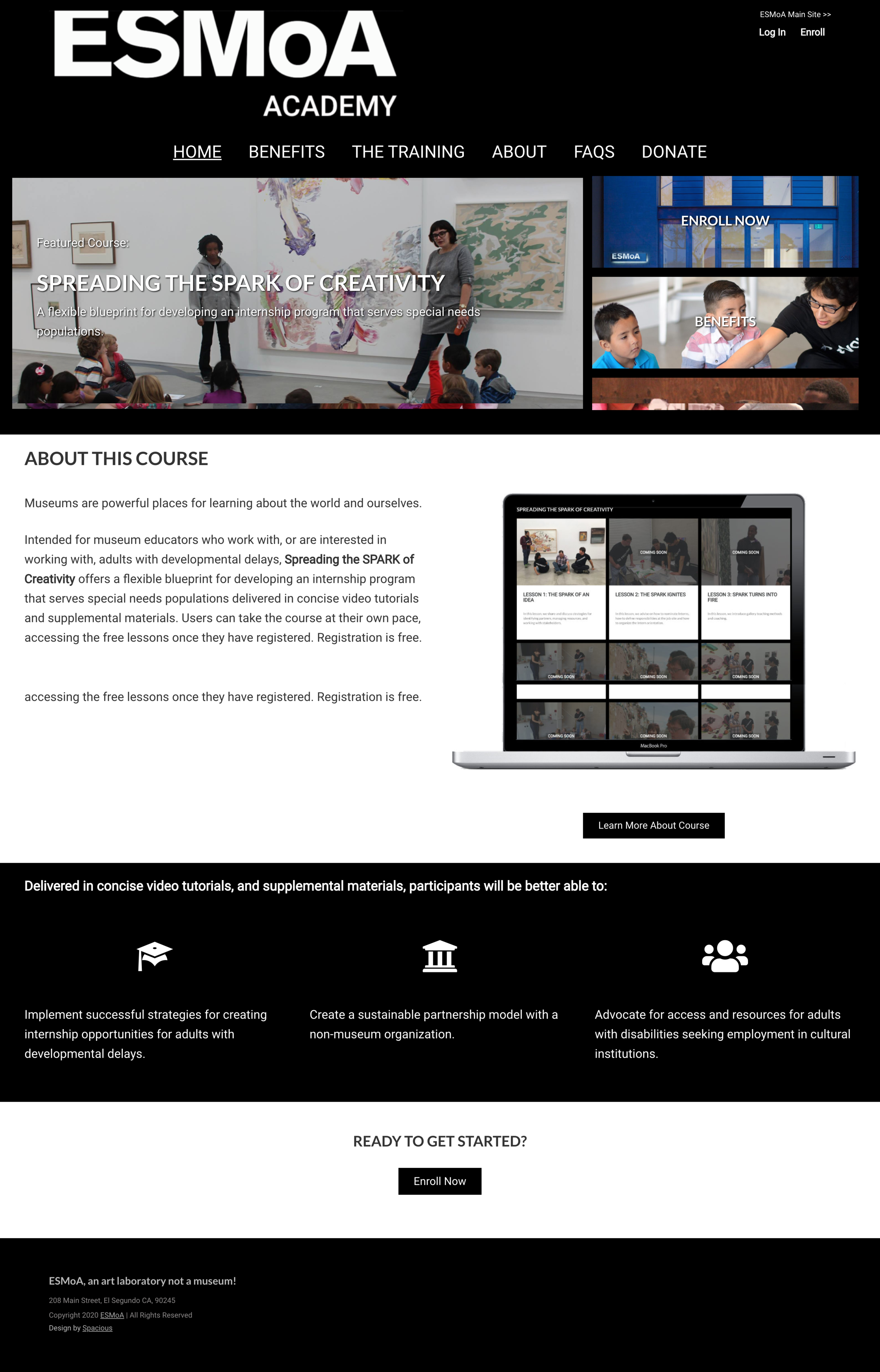
before: esmoa academy
Hard to see “back to main site” button, picture confused users as to what ESMoA Academy was, lack of information about the course.

After: esmoa academy
Left aligned “back to main site” button, description of ESMoA Academy, more prominent headers, more relevant photo, FAQ featured on landing page.

before: grid
No description of what this page is or how it functions, no instructions to tell user how to interact with it.

after: grid
Addition of a page that precedes the Grid gallery, and explains to users what it is and how to interact with it. This will decrease confusion, and increase user understanding.