Challenge:
Redesign platform to demonstrate organizations impact, and to enhance storytelling efforts.
Solution:
Conduct user research to discover areas of opportunity and enhance website by improving visual hierarchy, calls to action, and consistency throughout.
Watch to hear how my work impacted the Downtown Women’s Center
Users:
Donors
Volunteers
Potential Partners/ Sponsors
Methods:
Secondary Research
Competitive Audit
User Interviews
Benchmark Testing
Card Sorting
Content Strategy
UX Writing
Rapid Prototyping
Tools:
Sketch
Trello
InVision
Keynote
Defining the Problem
The Downtown LA Women’s Center does amazing work. Their mission is to end homelessness through the advocacy and empowerment of women. In order to keep serving women, their work needs to be communicated to users in the most effective way. The Downtown Women’s Center needed help telling their story, communicating their impact, and reaching more prospective donors, volunteers, and potential partners.
Initial Research
Benchmark Testing
Benchmark testing was conducted to see how well the site was currently functioning, and reaching its goals. Based on user interviews, it was found that areas of opportunity for the website included:
A more insightful landing page that includes statistics, impactful stories, and visual hierarchy
Restructuring of pages to improve hierarchy, and organization of information
Consistency of elements throughout the website (text, color, page layout)
More calls to action (donate button, join, get updates, etc)
More clear language
User Insights
User insights discovered during benchmark testing
Low Fidelity Wireframing
Design Recommendations
Below is a small sample of the screens I created for DWC that feature improved hierarchy, organization of information, and consistency in heading, text, color, and brand.
You can view all screens and my findings and recommendations report here:
before
Inconsistent brand colors, lack of hierarchy, no prominent call to action, heavy cognitive load.
after
I strengthened the brand colors/recognition, added more prominent call-to-action buttons, strengthened copywriting to display DWC value and mission right away.
before
Lack of hierarchy, lack of organization in text, users had a difficult time finding information in a natural order.
After
Added headers to let users know what they could expect from the paragraph below, decreased visual overload by moving image to the right, reinforced brand colors, and added more prominent call-to-action buttons.
before
Lack of hierarchy, lots of text, users didn’t know where to look first or how to quickly find important information.
After
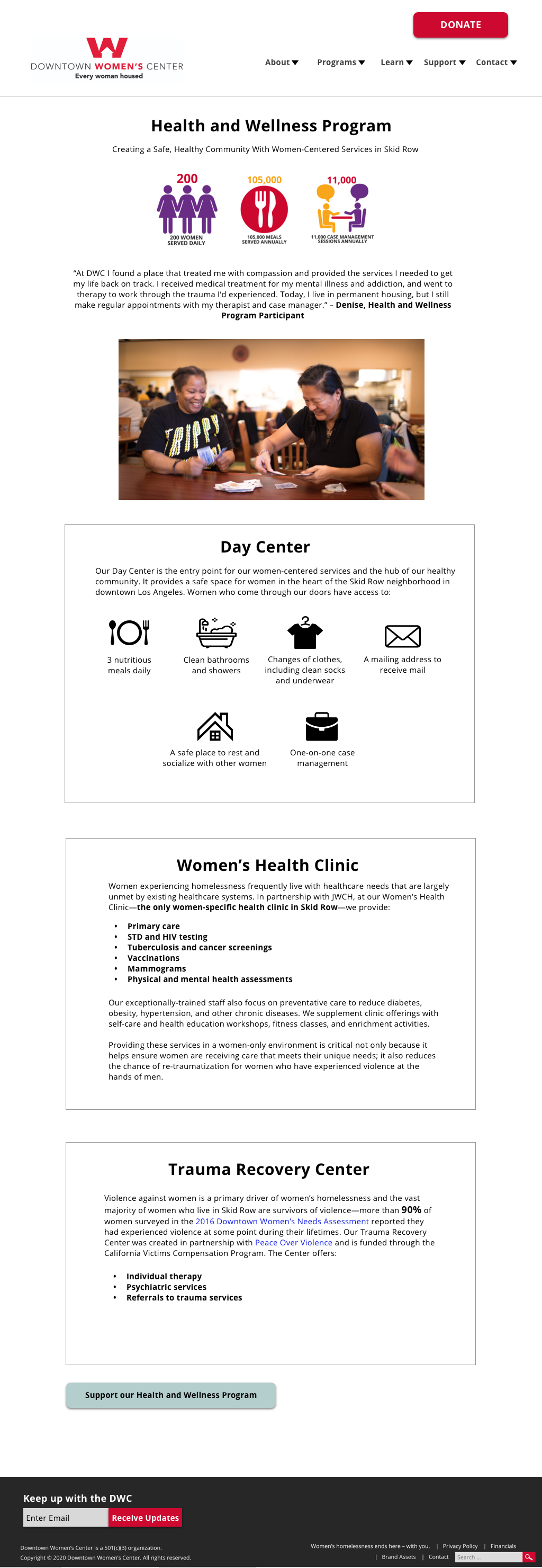
Added hierarchy, incorporated visuals to break up heavy text load, bolded important information to improve scannability, made clickable links blue to match users mental model.
Before
Heavy cognitive load, visual noise, lack of consistent colors, lack of hierarchy.
After
Incorporated hierarchy, displayed only the most important information, left aligned all text for easier reading, and added consistent brand colors.
before
Small and hard to spot buttons, non-actionable language, hard to fill out fields, lack of help and documentation, inconsistent brand colors.
After
More prominent call-to-action buttons, visuals to add storytelling element, easier fields to tab through, added help and documentation/changed language to explain ambiguous elements (i.e changed “additional information” to, “personalize your gift”).


